 FarmSmarter.ai
FarmSmarter.ai
FarmSmarter.ai
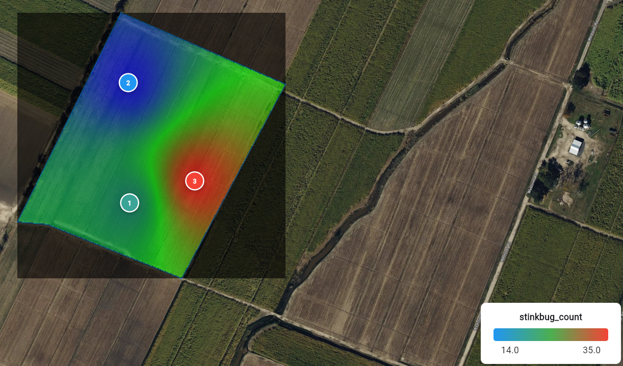
Every growing season, researchers and agronomists capture countless field notes—observations of pests, weeds, diseases, and other field conditions. Traditionally, these notes live in notebooks or spreadsheets, making it hard to see the bigger picture. At FarmSmarter.ai, we’ve developed a way to transform those notes into pressure maps—heat maps that reveal where insect or weed populations are concentrated. By combining field observations with spatial intelligence, researchers can identify hot spots, track pressure over time, and make smarter decisions about scouting, spraying, or trials. This feature isn’t limited to pest and weed pressure—it works with any spatially or temporally varying data that researchers want to visualize.
See Patterns Clearly: Visualize hotspots of pest or weed activity across a field. Support Targeted Decisions: Focus scouting, spraying, or sampling efforts where they are most needed. Improve Trials & Research: Document variability across a study site and measure the impact of interventions. Generalize Beyond Pests: Map nutrient deficiencies, disease symptoms, soil characteristics, or any field note tied to a location and time. Instead of isolated notes, you now have a dynamic map that tells a story.
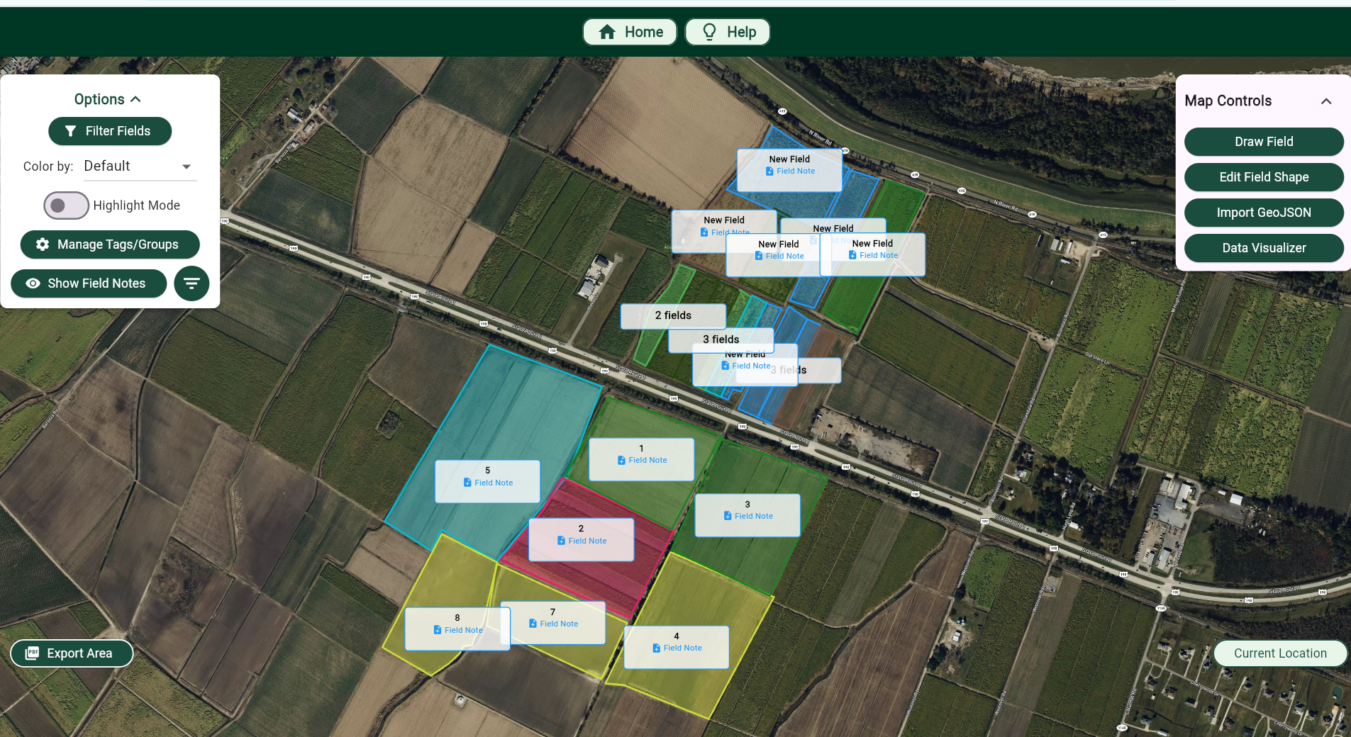
Before we begin, you first have to create a FarmSmarter.ai account. A premium account is needed to create visualizations, so follow this tutorial and use code FS3MONTHOFF for 3 free months of FarmSmart Premium! Now that you have an account, you must first draw out your field. You may draw as many as you'd like, but you can only visualize one at a time. When you're done, click on add field note or select highlight mode to add notes to multiple fields at once.
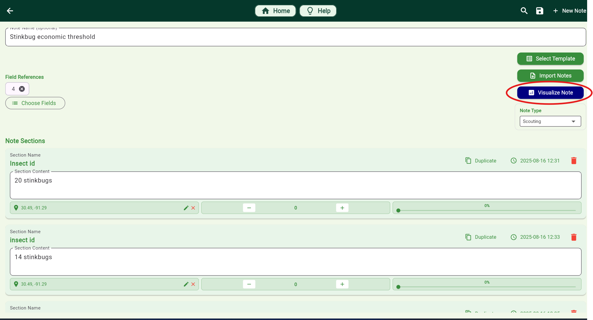
Great! Now, fill out the note with whatever varying information that you want, or select a template to help get you started. To use visualizations to their fullest extent, make sure to add location data either while you're in the field or manually click where the section was taken. In order to visualize a note, the data must vary in space or time. Once you're finished, click the 'Visualize' button at the top. If you only want to analyze spatial differences, be sure to toggle the "Ignore Time" checkbox.
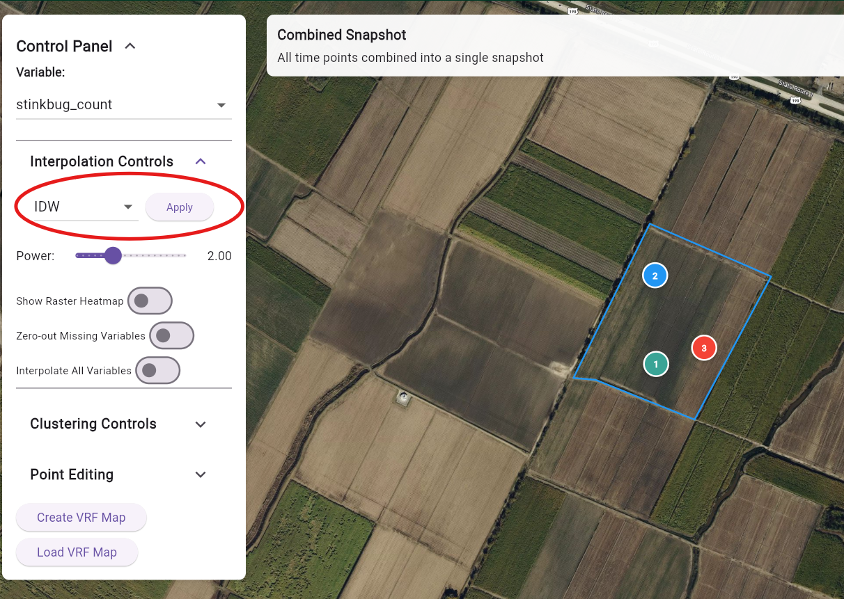
Watch your field note come to life! You now should see something similar to below, where nodes representing different data points are scattered throughout your field where you input the coordinate locations. If you'd like to move, edit, or add any points, you can do that by either clicking on each of the points or clicking on "Point Editor". You can access this visualization at any time by selecting "Data Visualization" from the navigator. You will see on the control panel "Interpolation Options". Click on the "Apply" button, and watch your heat map get generated. If you are having trouble getting here, please do not hesitate to reach out by contacting support@farmsmarter.ai.
Congratulations! You have just created a heat map of your field note data! Feel free to explore other functionalites such as clustering or Variable-Rate Applications for nutrient needs maps!

Entomology Trials: Track insect population shifts across a field. Weed Mapping: Identify zones with higher infestation for targeted herbicide trials. Nutrient Stress Studies: Overlay visual symptoms with lab data for deeper insights. Field Variability Research: Document temporal trends across multiple scouting sessions.
With FarmSmarter.ai, your field notes are no longer static records—they become interactive maps that drive better decisions and research outcomes. This tool empowers agricultural researchers and professionals to bridge the gap between qualitative observations and quantitative insights—helping you visualize, analyze, and act with confidence.

MONROE, La., April, 2025 – FarmSmarter.ai, an innovative agricultural technology star

Baton Rouge, La., August 6, 2025 – FarmSmarter.ai, the Louisiana startup turning cutt